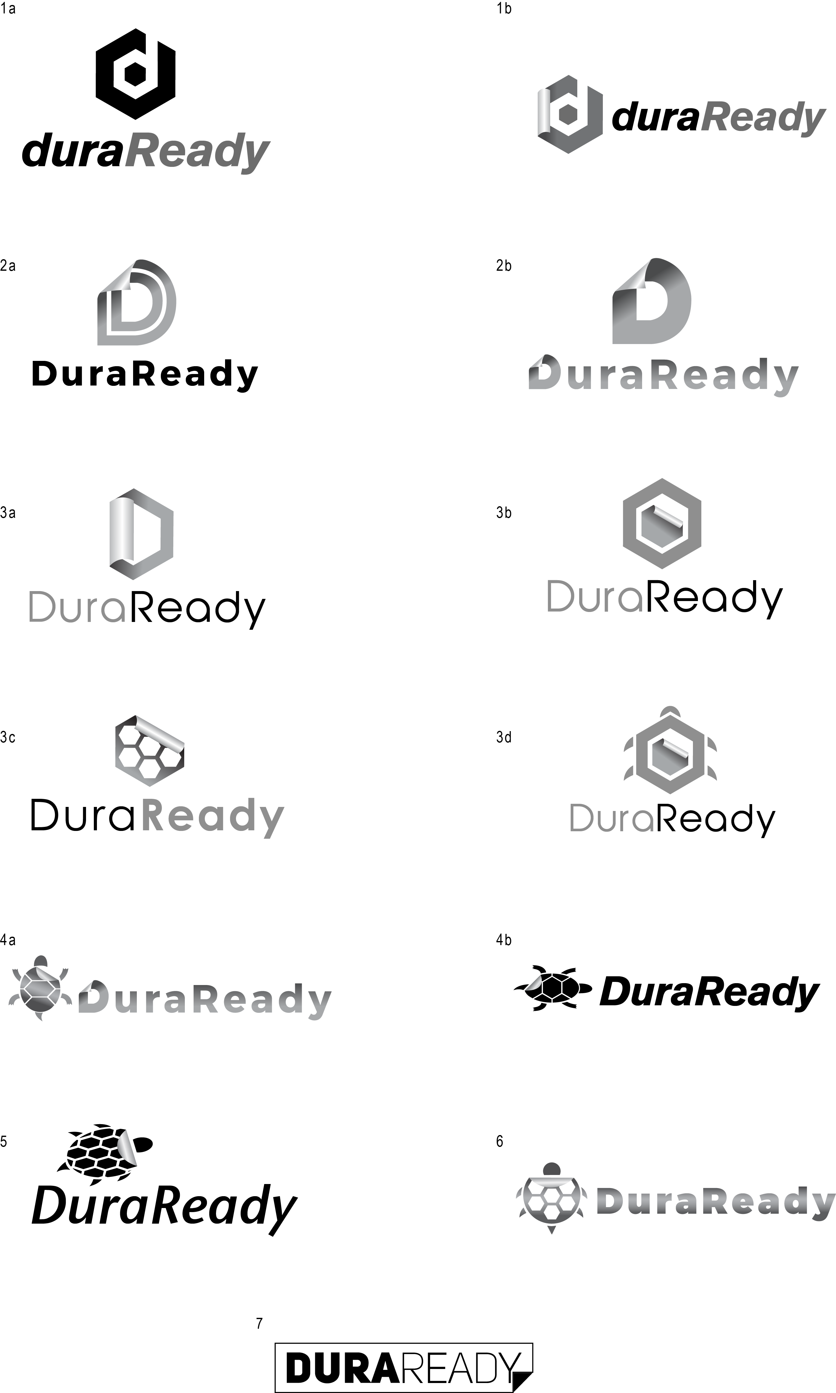
DuraReady needed a logo which would represent the durability of their printer label materials. The client had a concept of using a turtle shell in which we tried multiple options with, or incorporating the peel effect into the logo to represent a sticker label. We ended up simplifying and instead took a shape typically found in the pattern of a turtle shell which still gives the feeling of durability and a splash of green as the color choice. We chose to incorporate the first letter of the company into the icon which creates interest and an icon which can stand alone.
See the final color logo below as well as some of the earlier concepts which were given to the client as choices.


Recent Comments