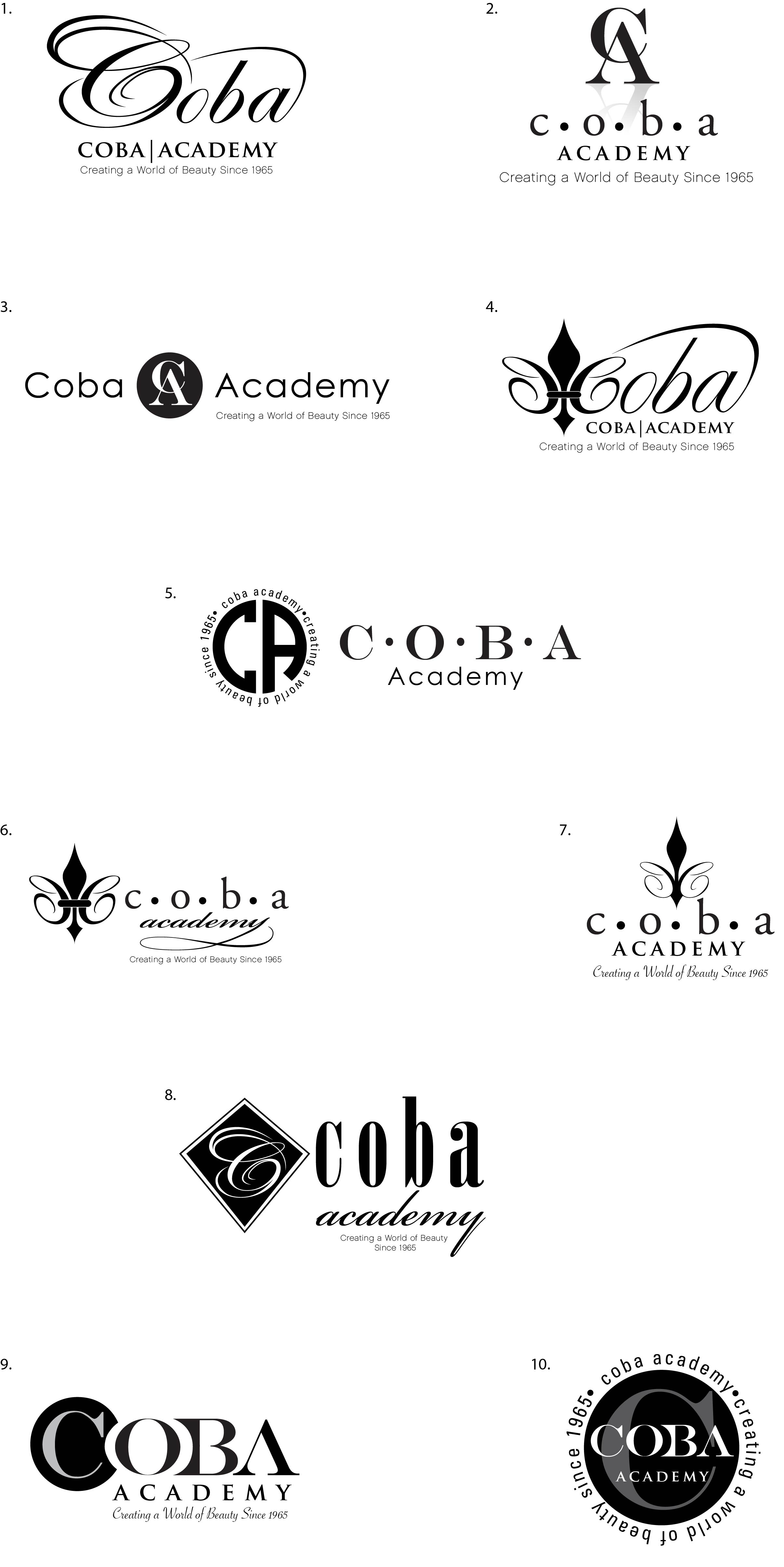
Coba Academy asked our team to create them a new logo since it is now under new ownership. They asked to have a feminine appearance and to either use a monogram, fleur de lis symbol, or script writing in the logo, but also keeping it somewhat modern. We chose to try both scenarios and gave the client a handful of options to choose from. The above final chosen design is a hand drawn letter “C” which we created to give a hair-like look and feel.

We delivered the above first round of concepts to the client. From here the client chose #1. With minor revisions, we had a winner and the client was very happy.

Recent Comments