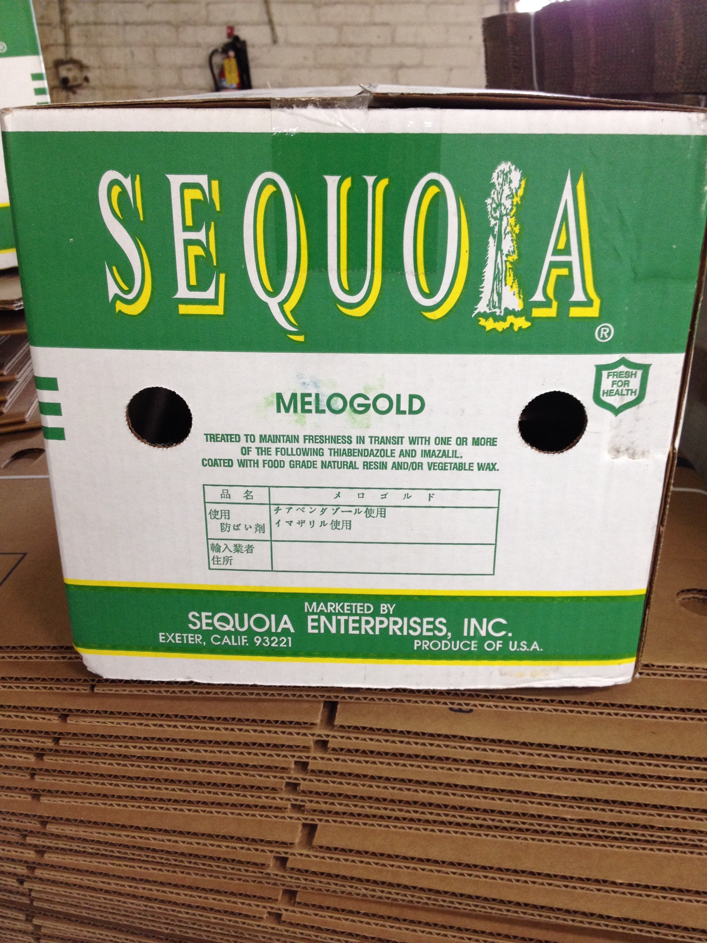
Sequoia contacted us for a new, current spin on their logo. The client requested a series of options because they were not sure whether they wanted to get away from the tree icon and focus on their products, or stick with the original logo, and just give it a modern twist. Below is the original logo on their packaging followed by the series of options we presented to the client. This project is incomplete but demonstrates the evolution of our logo thought process.